From Palette to Palate: When Colour Theory Meets Culinary Design
We eat first with our eyes. Before the first bite, before the aroma even reaches us, it’s the visual composition of a dish that captures attention and sparks appetite.
In 2025, chefs and café designers alike are taking inspiration from the world of colour theory, blending artistic principles with culinary craft to create dining experiences that are as visually captivating as they are delicious.
When colour is considered as carefully as flavour, the result is a plate that tells a story before you’ve even lifted your fork.
Colour Theory on the Plate
Colour theory, long used in art and design, is becoming a powerful tool in menu development and plating. It’s about more than aesthetics, it shapes mood, appetite, and even perceived taste.
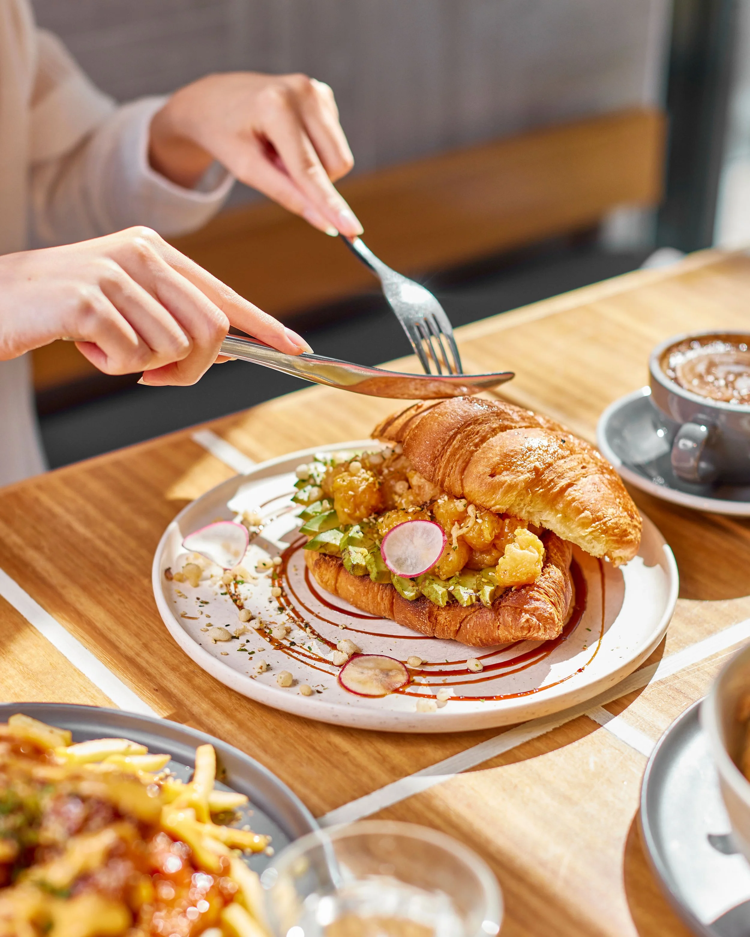
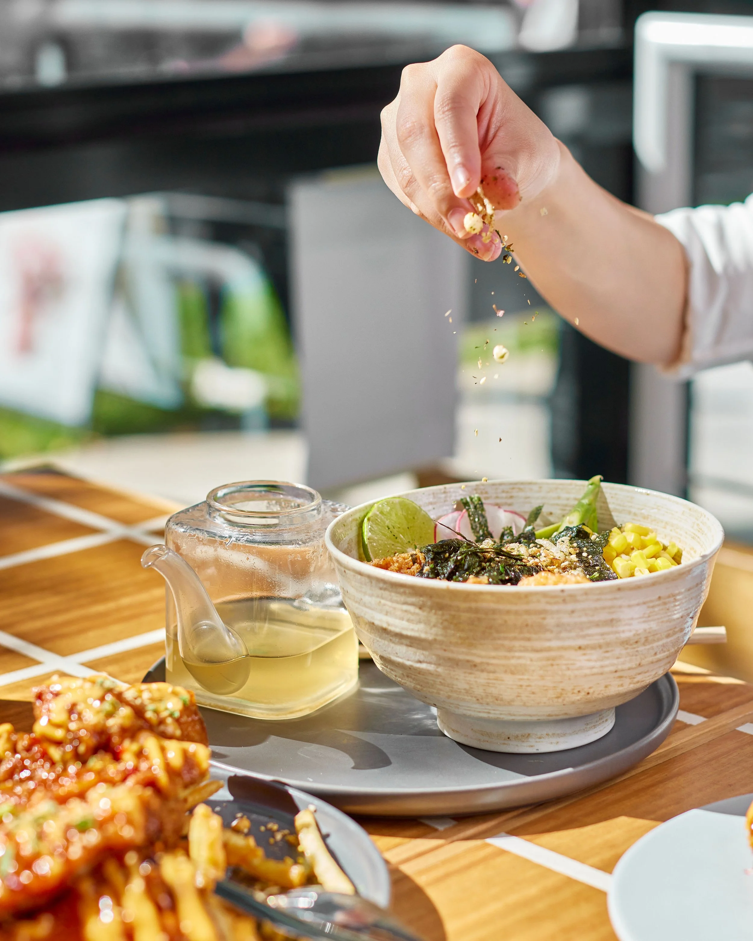
Complementary Colours: Pairing opposites on the colour wheel, like deep beetroot red against fresh green herbs, for a visually striking and energetic effect.
Analogous Palettes: Soft gradients of similar hues, such as golden pumpkin, roasted carrot, and turmeric cream, for warmth and comfort.
Monochrome Moments: A plate built around variations of a single colour, letting texture and form do the talking.
These colour choices guide the diner’s gaze and enhance the emotional connection to the dish.
The Psychology of Colour in Food
Different colours don’t just look different, they feel different.
Reds and Oranges: Stimulate appetite and evoke energy.
Greens: Suggest freshness, vitality, and health.
Blues and Purples: Rare in nature, they intrigue and surprise, often associated with creativity and luxury.
Neutrals and Earth Tones: Grounding, warm, and comforting, they give dishes a natural elegance.
By consciously layering these associations into plating, chefs can subtly influence the way diners experience a dish.
From Kitchen to Café Space
The influence of colour theory doesn’t stop at the plate. It flows into the café’s interiors, menus, and branding.
Tableware as Canvas: Plates, bowls, and cups chosen to complement and contrast with the food they hold.
Interior Accents: Upholstery, wall finishes, and art that echo the colours found in seasonal menus.
Menu Design: Typography and colour coding to signal dietary choices, seasonal specials, or flavour profiles.
When the colour story of the space and the menu align, the brand identity feels richer and more cohesive.
Colour and the Social Feed
In the digital age, a dish’s visual impact often extends far beyond the table. Bold, well-balanced colour compositions are more likely to be photographed, shared, and remembered—turning one guest’s plate into a piece of brand storytelling that travels far wider.

The Takeaway
When culinary design embraces colour theory, it’s no longer just about taste; it’s about mood, memory, and meaning. A dish can be comforting, energising, intriguing, or nostalgic, all through the careful orchestration of colour.
From palette to palate, thoughtful colour design turns a meal into an experience—one that lingers in both memory and imagination.